The Client
Arkansas State University Newport Nestled on the grounds of a historic WW2 airfield, Arkansas State University – Newport (ASUN) embarked on a transformative journey to establish a sports program and craft a vibrant identity. However, the challenge was distinctive – bridging the legacy of military aviation with the creation of a modern sports identity.
The Project
Arkansas State University – Newport (ASUN) faced a unique challenge in establishing a sports program from scratch while differentiating itself from the main flagship campus. Unlike its flagship campus, Newport lacked a sports program, and the client desired a fresh, vibrant identity that would set it apart and create a unique legacy. I and the other designers at Rocket Chimp tackled creating concepts for their new branding.
My Designs
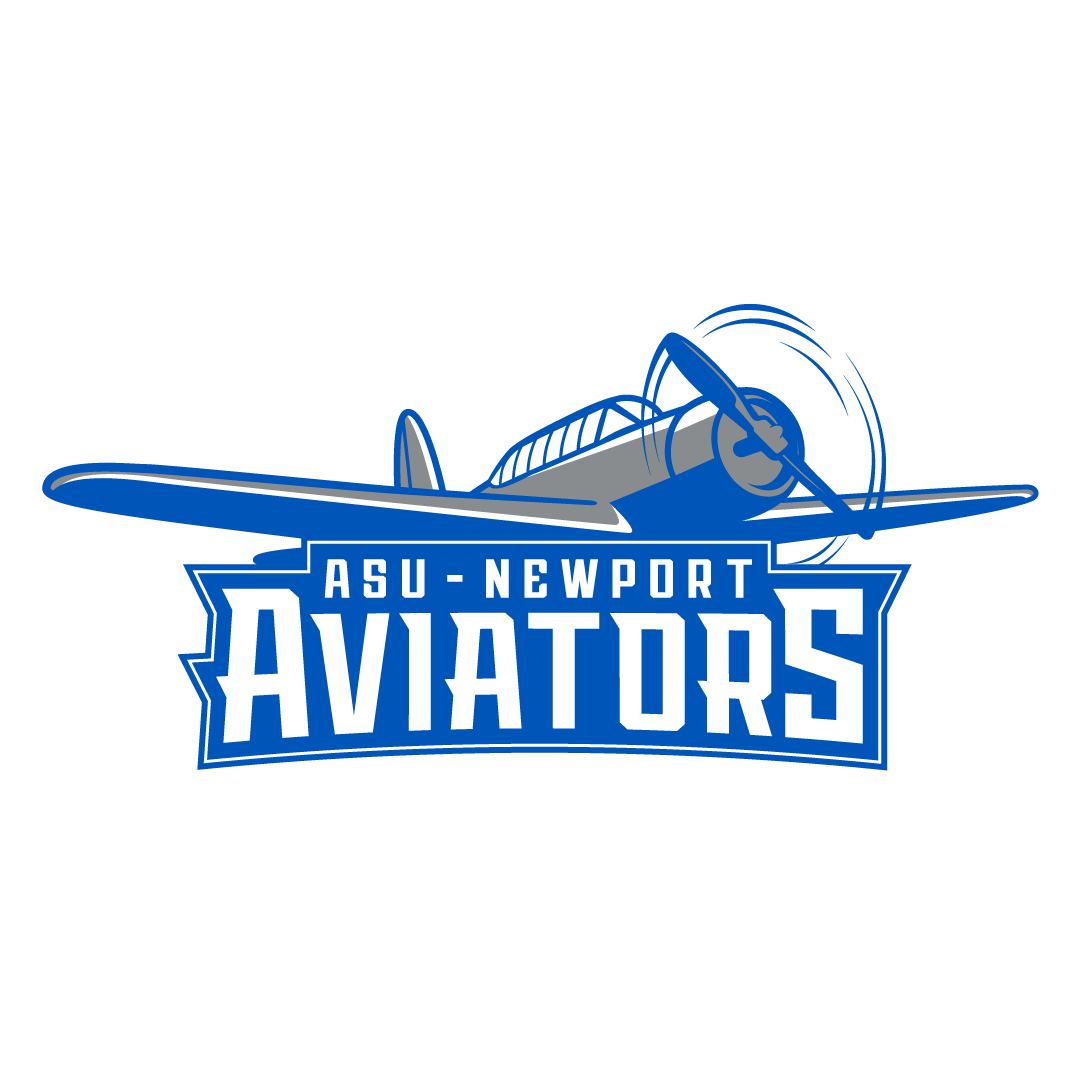
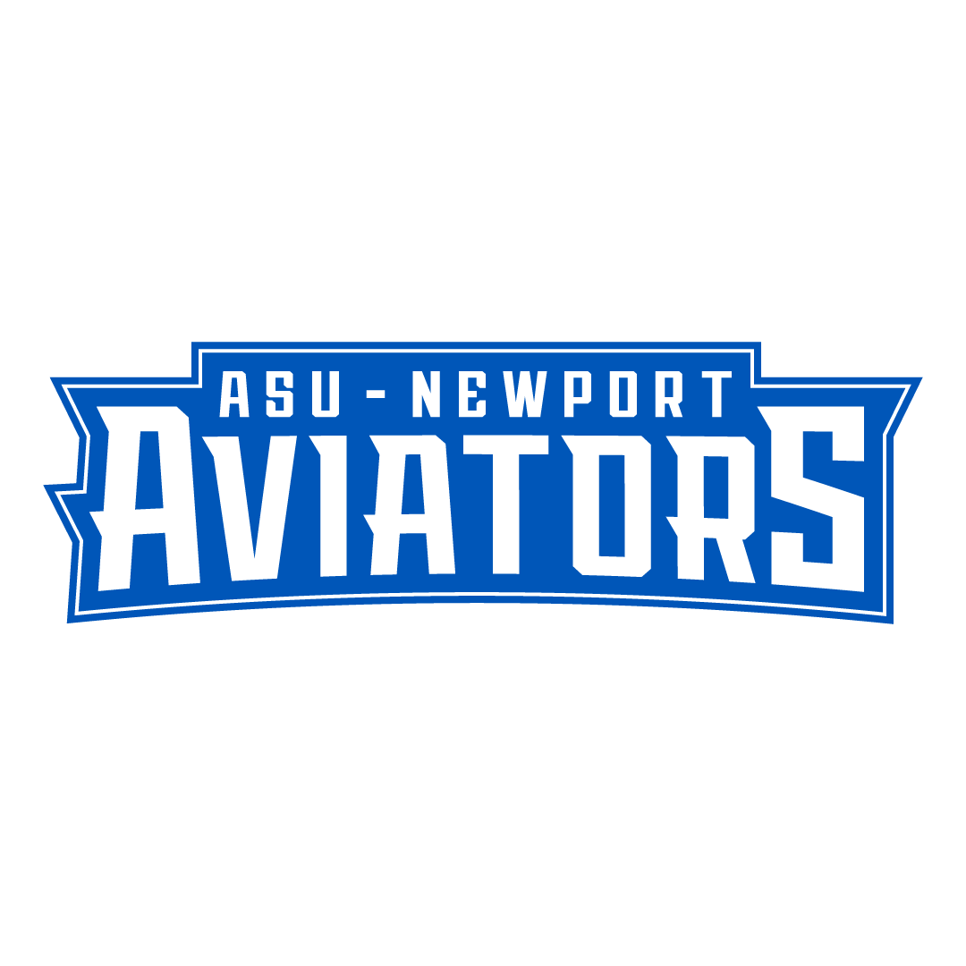
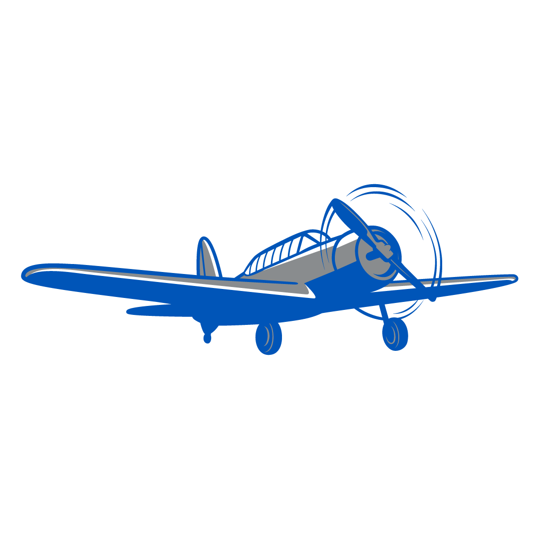
To leverage the campus’s rich history of military aviation I looked to using a training plane that had been used during it's time as an army airfield. I illustrated a stylized Vultee BT-13 Valiant illustration and crafted a wordmark to capture the essence of aviation merged with the dynamic energy and competitiveness of sports.
Final Outcome
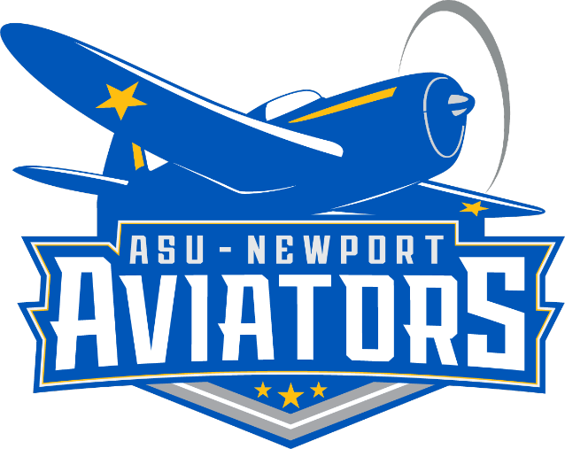

Based on the feedback from everyone's submissions the final branding was tackled by our creative director, Matt Stewart. Even though the ASU-Newport team decided to go with a different plane illustration, I was happy to see other elements of my concepts did find their way into the final designs.
The Client
Tempest Roofing is a new roofing company specializing in roofing solutions for commercial and multifamily buildings nationwide. They want to be known for their commitment to satisfaction through transparent communication, timely project completion, and expert craftsmanship.
The Project
Tempest Roofing was looking for branding for their new company. They are a team of experts with years of experience. They wanted their brand to feel friendly, classy, and, with a touch of corporate style. They liked the color blue because it shows trust. Their big selling point is their years of experience, which they wanted to show off in their new branding.
My Designs
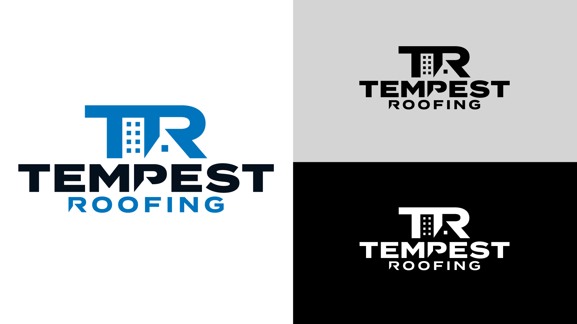
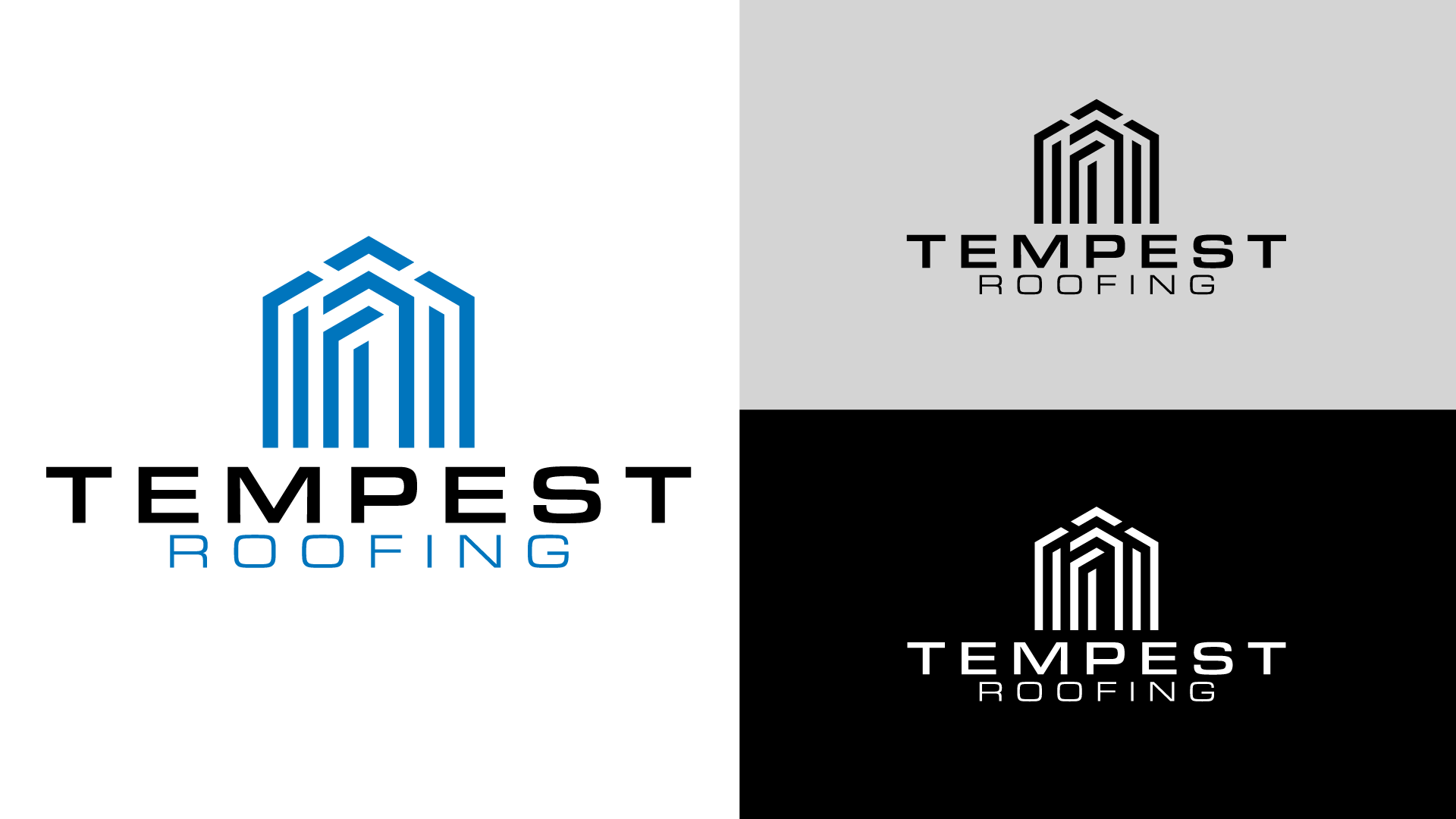
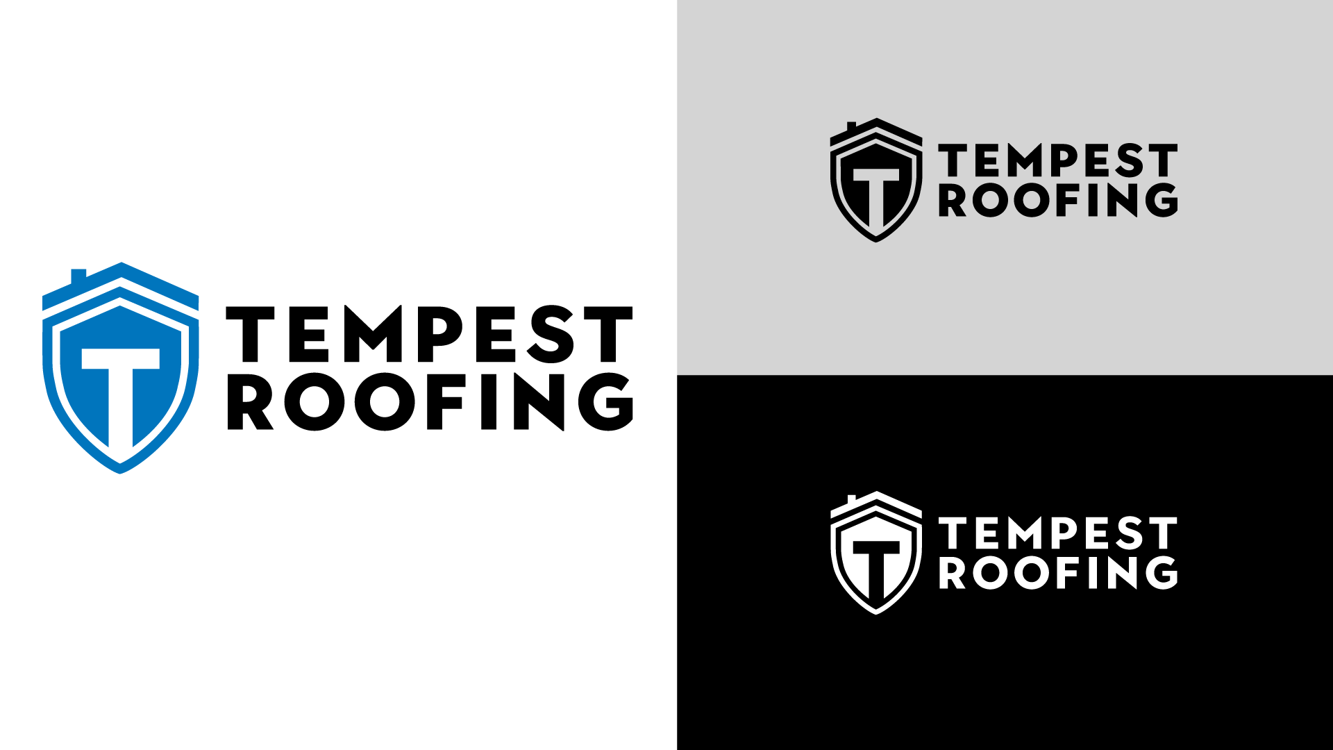
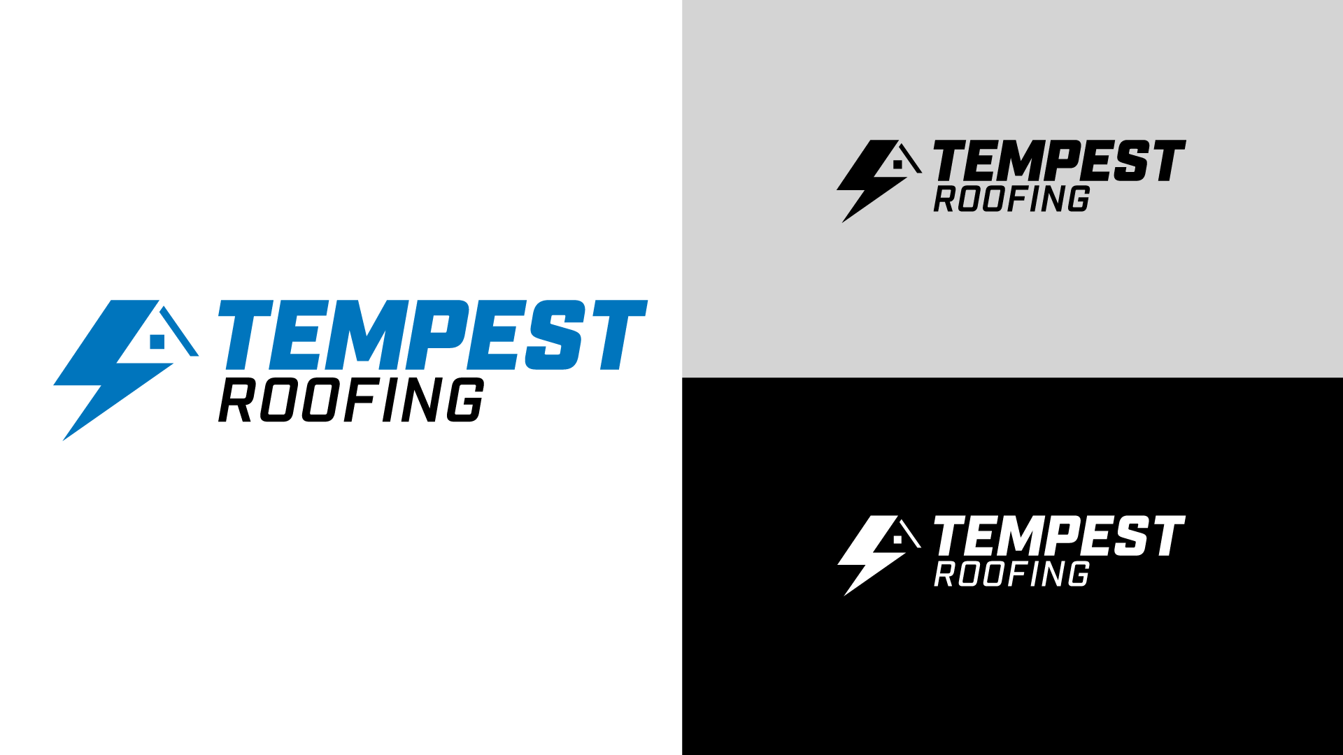
A goal during my brainstorming was to try to capture both commercial and multifamily roofing in my designs. I think my first two designs did that well with the used of negative space. For the third, I crafted a shield mark and bold typeface, embodying security, strength, and trust. And my last design I took a more literal approach with "Tempest." Incorporating a lightning bolt and negative space to crate a roof. The mark and typeface gave a sense of energy, and power.
Final Outcome
The final design was a combination of the logomark from my first and the typeface from my second one. The outcome, a sleek, professional emblem perfectly tailored for commercial roofing. Its clean design gives a sense of reliability and expertise, making it a standout symbol in the industry. The truck wrap design and other collateral was created by Bart Pryor.
